- AUDEMARS PIGUET88 products
- ROYAL OAK88 products
- ROYAL OAK OFFSHORE22 products
- IWC7070 products
- AQUATIMER99 products
- INGENIEUR1717 products
- PILOTS WATCHES22 products
- PORTOFINO1818 products
- PORTUGIESER2424 products
- Jaeger-LeCoultre55 products
- OMEGA8787 products
- CONSTELLATION2121 products
- DE VILLE2020 products
- SEAMASTER2424 products
- SPEEDMASTER2222 products
- PANERAI2424 products
- LUMINOR1313 products
- Panerai 40mm11 product
- Panerai 42mm11 product
- Panerai 44mm33 products
- Panerai 47mm11 product
- SUBMERSIBLE1010 products
- PATEK PHILIPPE6363 products
- RICHARD MILLE88 products
- ROLEX140140 products
- AIR KING44 products
- DATEJUST2424 products
- DAY DATE2424 products
- DAYTONA2525 products
- DEEPSEA44 products
- EXPLORER44 products
- GMT MASTER II1212 products
- OYSTER PERPETUAL1414 products
- SEA DWELLER22 products
- SKY DWELLER1414 products
- SUBMARINER55 products
- YACGT MASTER88 products
- VACHERON CONSTANTIN9292 products
- EGERIE COLLECTION1313 products
- FIFTYSIX COLLECTION1313 products
- HISTORIQUES-COLLECTION2222 products
- OVERSEAS COLLECTION2525 products
- PATRIMONY COLLECTION1010 products
- TRADITIONNELLE COLLECTION1414 products

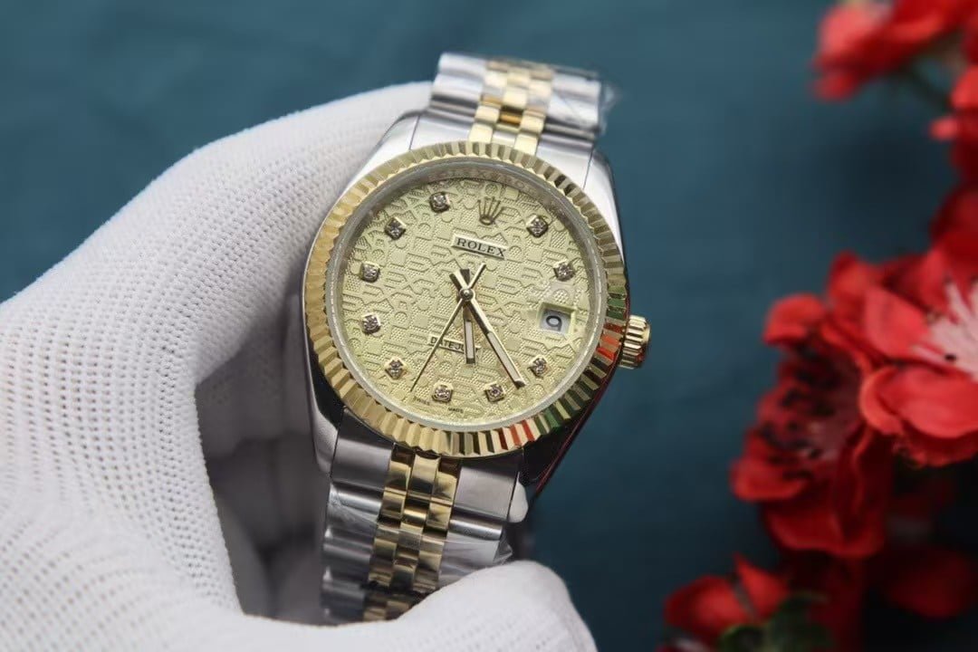
Two-Tone Datejust Style – Gold Pattern Dial with Diamond Markers
Two-Tone Datejust Style – Gold Pattern Dial with Diamond Markers
Written from the bench of a VSF watchmaker
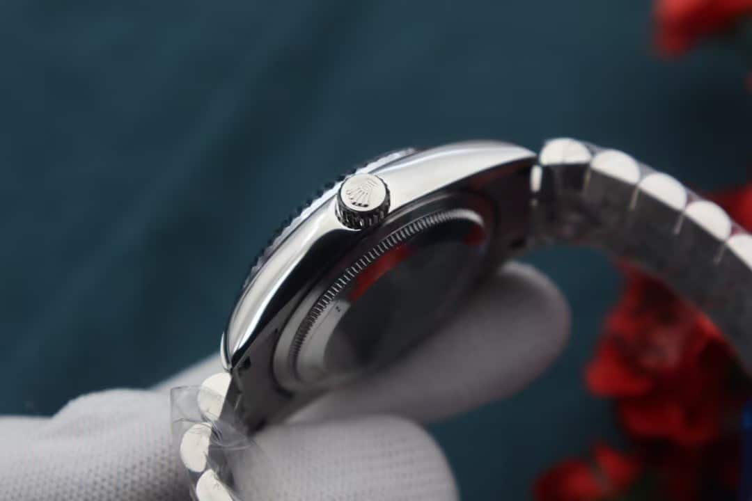
I still remember the first time I saw this dial under the workshop lights. Most dials we handle have a predictable rhythm — sunburst lines, a matte texture, a simple color gradient. This one doesn’t behave that way. The geometric pattern shifts depending on where the light lands. Sometimes it looks almost engraved, other times it softens into something smoother and warmer, like a piece of metal that has been handled for years. That unexpected depth is what makes this particular build more interesting to assemble.
Working on two-tone pieces has its own challenges. Gold brings out every flaw, especially around the bezel. If the ridges aren’t cut evenly, the reflections instantly look wrong. So we machine these bezels in slower passes. It takes longer, but the result is cleaner — crisp lines that catch light in a way that feels sharp but not harsh. When you see it in natural light, the bezel almost looks animated, like it’s breathing with every small movement of your wrist.
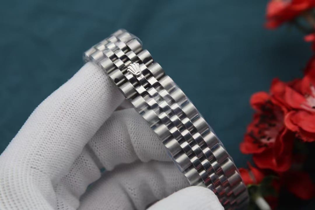
The bracelet is one of those parts that look simple until you try assembling one. Getting the center gold links to sit perfectly between the steel segments requires a certain rhythm. Too much pressure on the pins and the link loses its smooth drape; too little and you get a tiny rattle you can feel when you move your wrist. People don’t talk about these things when they review watches, but they matter. A watch can look expensive but feel cheap the moment the bracelet misbehaves. This one feels right — flexible, quiet, and balanced.
The dial is where the watch earns its personality. Gold can easily cross the line into loudness, but the patterned texture keeps it grounded. The diamonds aren’t oversized, and we deliberately avoid overly shiny settings. When you pair them with the patterned dial, the sparkle becomes more of an accent rather than the center of attention. In my experience, this dial works best for people who like gold but don’t want their watch to shout from across the room.
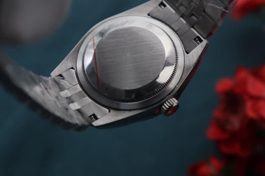
The movement inside is our usual daily-wear setup — not built for display through an open caseback, but built to stay dependable. Smooth winding, solid click feedback, and a rotor that doesn’t sound like it’s fighting the case. It’s the sort of movement you forget about in the best possible way. It just works. You can leave it on your dresser for a weekend and it’ll still feel alive when you pick it back up.
What I appreciate most about this piece is that it has character without requiring confidence. Some watches demand attention; this one keeps it. It looks elegant on a good shirt, but it doesn’t look out of place with a T-shirt. The two-tone finish adds presence, but the patterned dial softens the whole design, so it never feels like you’re trying too hard.
As someone who has assembled more watches than I can count, I enjoy when a piece reminds me why people love this style in the first place. It’s the little things — how the bezel catches morning sunlight, how the gold center links warm up against your skin, how the dial changes tone when you tilt your wrist. These aren’t dramatic features; they’re quiet moments. But they’re the moments that make you reach for the same watch again the next day.
If you’re looking for something that feels classic but not predictable, polished but not loud, this one tends to leave a lasting impression. Not because it demands it — but because it earns it slowly, wear after wear.