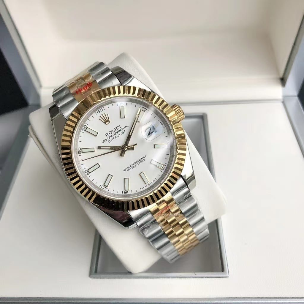
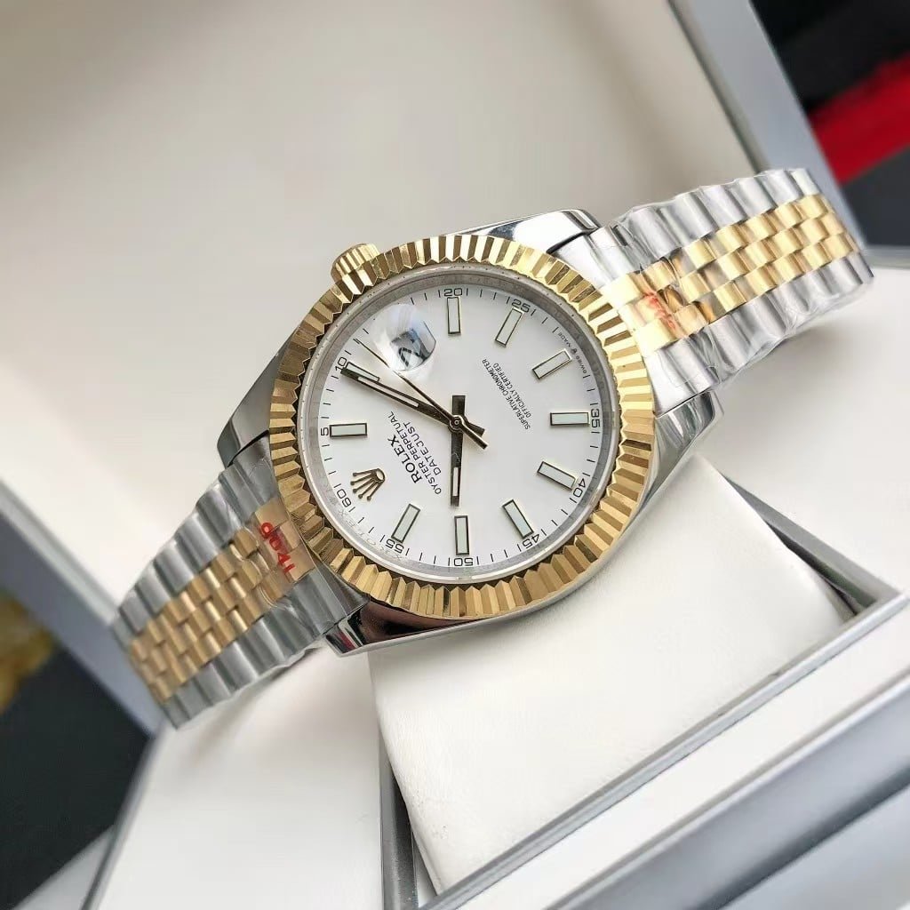
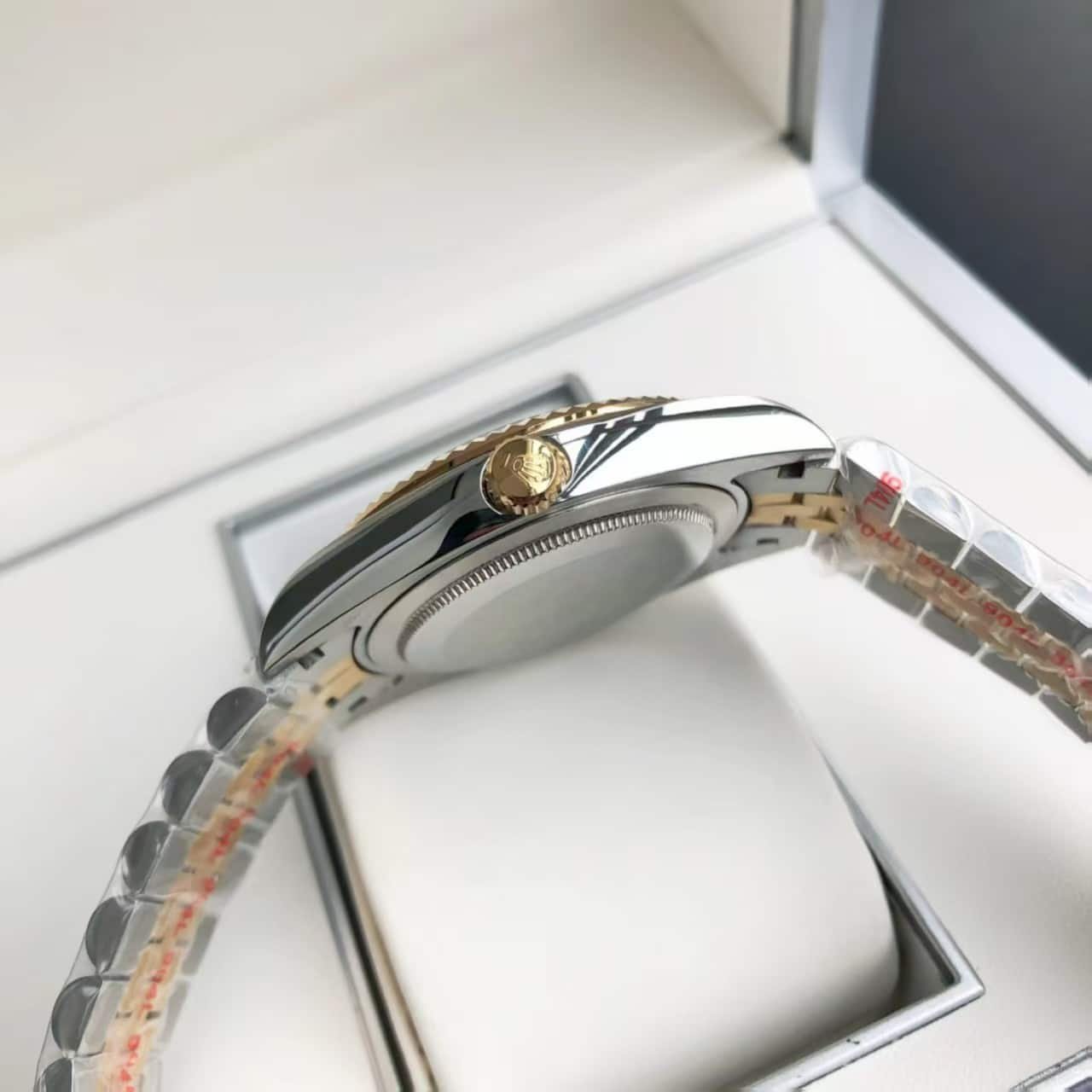
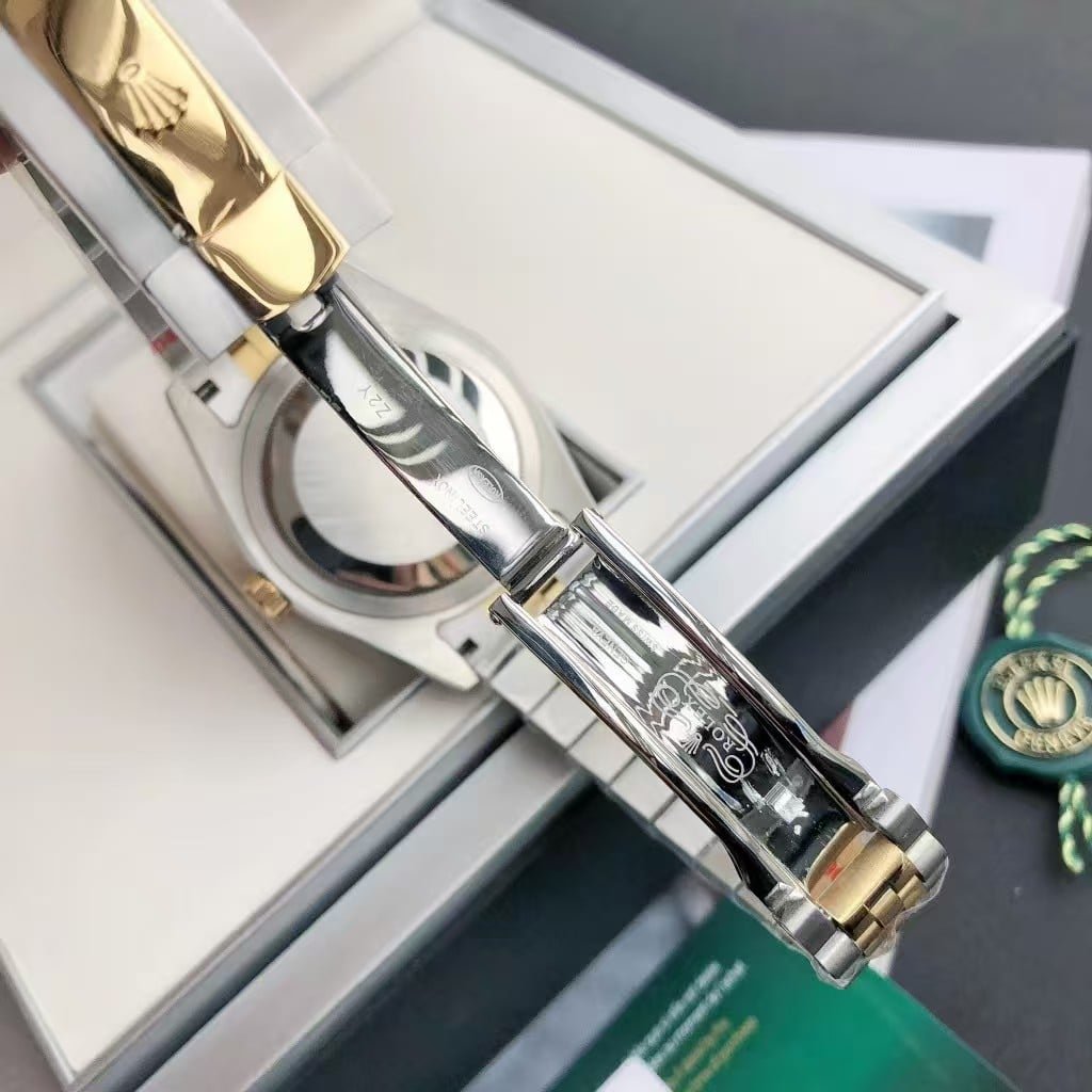
The gold-tone bezel is another component we handle more slowly. A fluted bezel only looks right when the cuts are clean and the reflections travel evenly across the ridges. If even one cut is slightly off, the entire bezel throws back uneven highlights. During QC we rotate it under strong white light just to confirm the geometry stays consistent across the entire ring. A good bezel doesn’t call attention to itself; it simply frames the dial without distorting it.
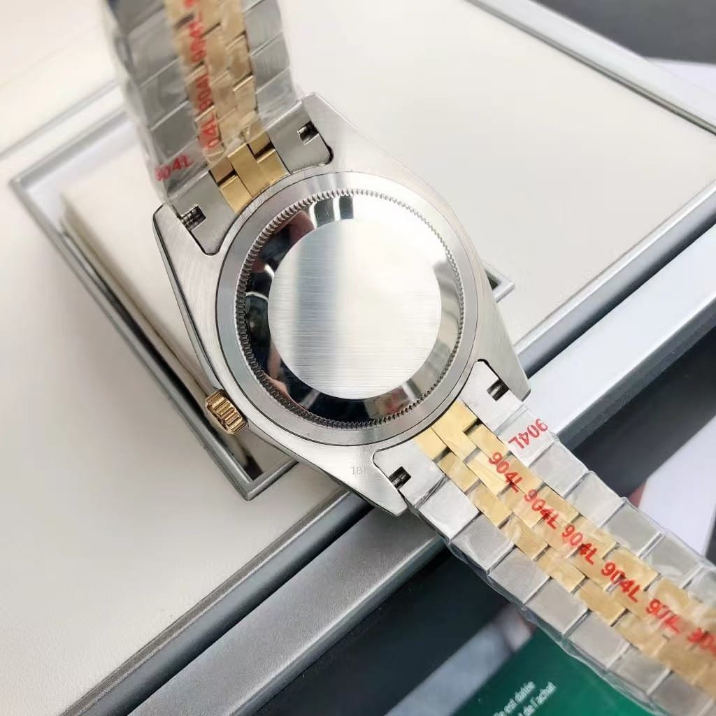
The bracelet is a familiar two-tone Jubilee style, but we check the center links against the bezel plating every time. If the gold tone on the bracelet drifts too warm or too cool compared to the bezel, the mismatch becomes obvious on the wrist. People don’t always know why a watch “looks off,” but color imbalance is usually the reason. VSF puts a lot of effort into narrowing that variation. The bracelet should drape comfortably, with no stiff sections or overly loose links. When it falls on the wrist naturally, you feel the difference right away.
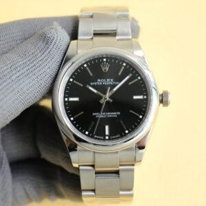
What many owners appreciate about this model is how dependable it feels in everyday use. The 3235-style movement inside isn’t built for show; it’s built for wear. It winds smoothly, holds stable time, and doesn’t create the loud rotor noise some budget movements struggle with. It’s not a movement you think about much after you start wearing the watch, which is exactly what people want from a daily piece. You don’t need to be careful with every gesture, and you don’t need to baby the watch. Normal office work, driving, errands, or dinner out—it fits into all of those without asking for attention.
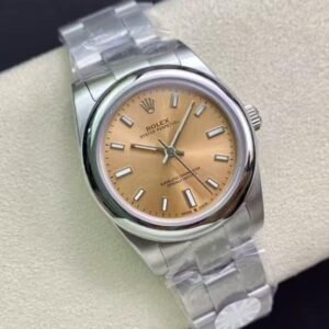
The white dial works well because it’s clean without being empty. The markers stay crisp, and the gold-tone hands pick up just enough contrast to remain legible without overwhelming the dial. On wrist, this combination reads “easy to wear” more than “try to impress.” A lot of watches in this colorway can feel overly formal; this one sits somewhere in the middle, which is why many people end up wearing it far more often than they expected.
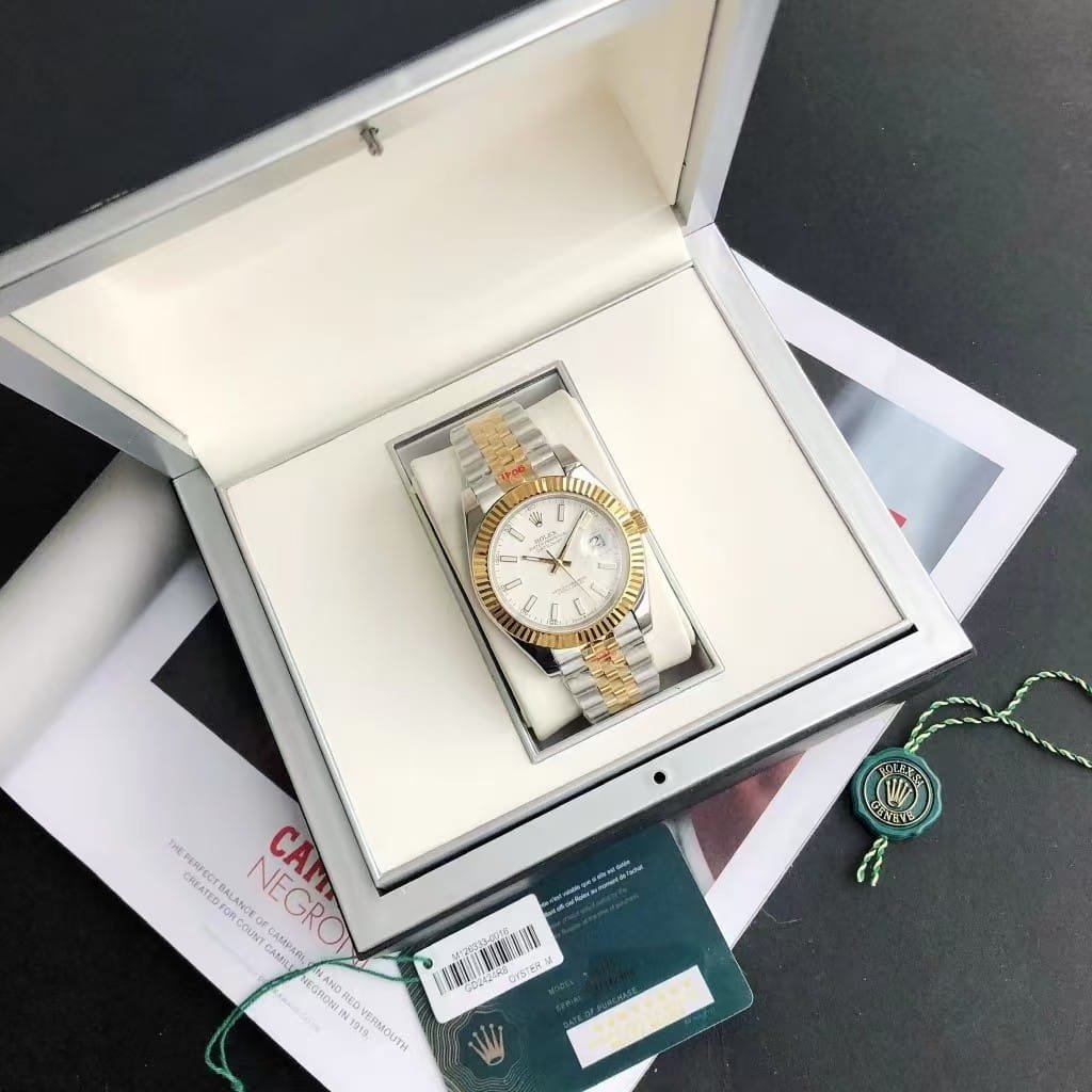
If you’re considering this configuration because you want something reliable, not overly flashy, and suitable for both everyday and slightly formal settings, this build tends to fit those needs well. It’s a watch designed for steady, long-term use rather than short-term novelty. From our side of production, this is the kind of piece we’re comfortable letting out of the workshop because it stands up well to the realities of daily wear—not just a perfect moment under studio lights.