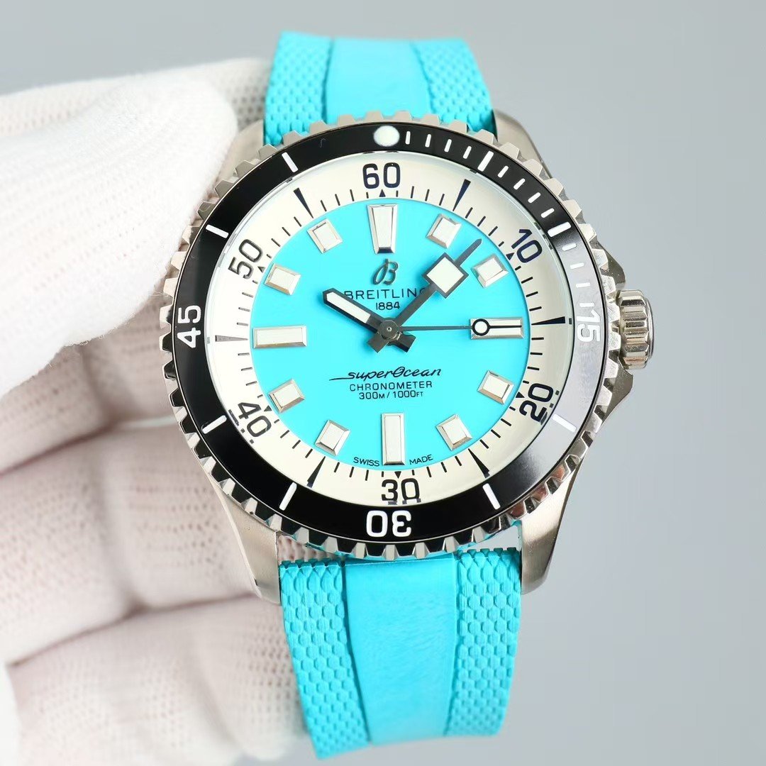
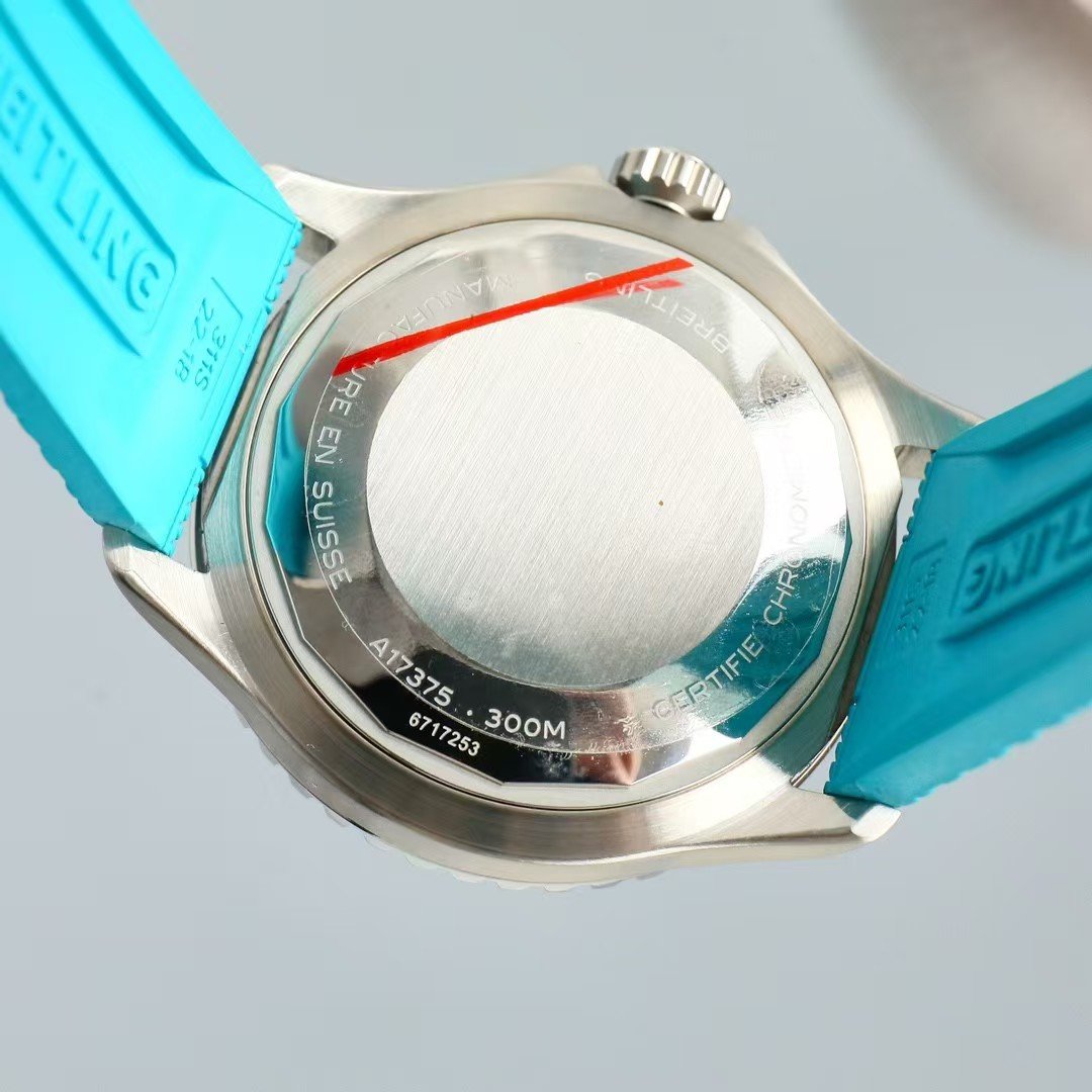
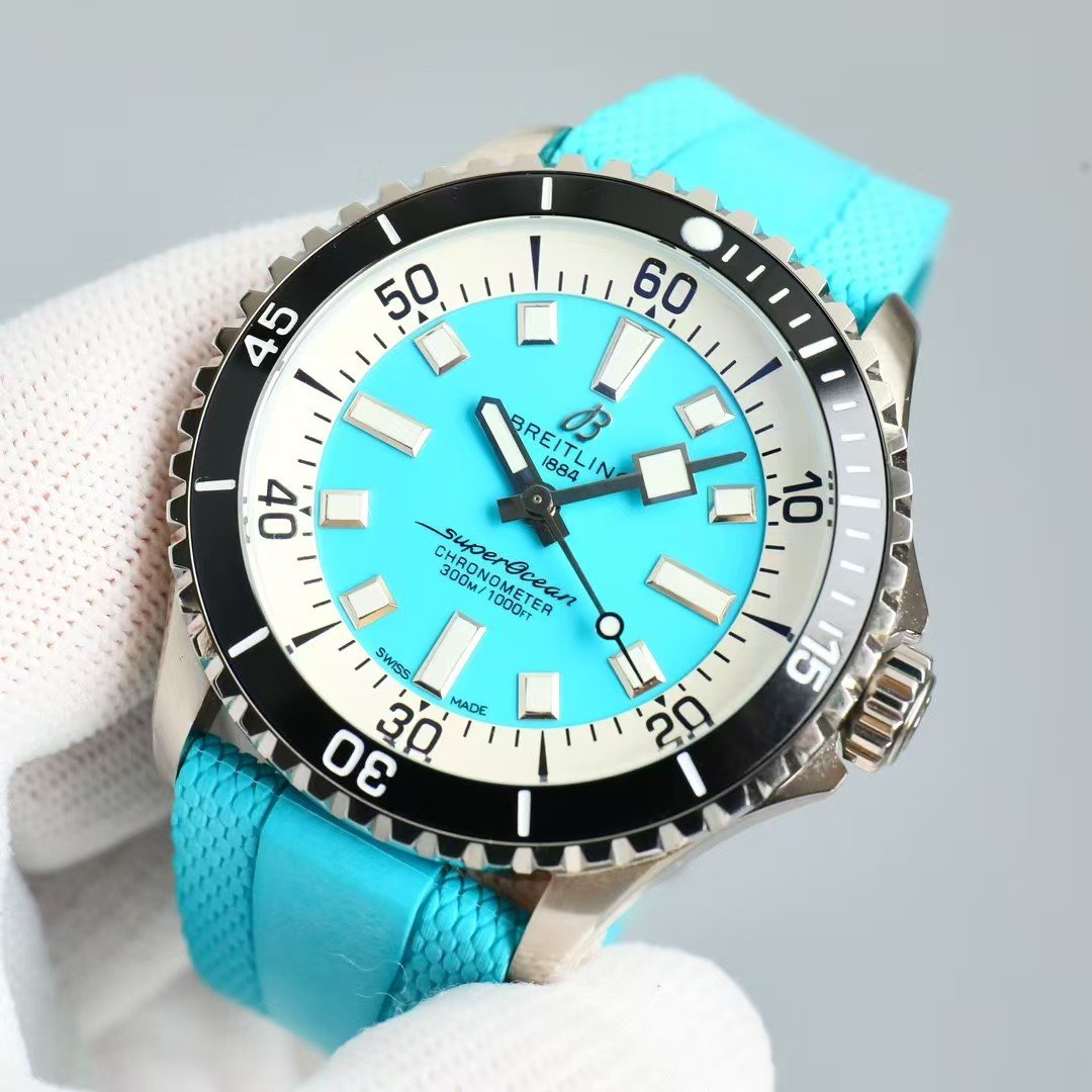
1. First Moment on the Wrist — the Color Does the Talking
The first thing you notice is how clean the dial looks even with such a bold color.
Most replica ocean-blue dials get too shiny or patchy. This china super clone doesn’t.
The finish stays even, and the white minute track frames the blue in a way that feels intentional, not decorative.
When the watch tilts, the dial lifts itself a little, almost like water reflecting light. It’s a behavior—not a design trick—and it’s what makes this BLS-grade piece feel more refined than typical replica attempts.
2. Bezel Behavior — Contrast That Actually Works
The black bezel might look simple, but it’s what keeps the watch grounded.
Without it, the dial would float too much.
With it, the watch has a clear sense of structure: bright center, dark frame, clean numerals.
Rotation feels crisp, almost dry, with no wobble—something many colored SuperOcean replicas fail at. The alignment stays tight even after daily use.
3. Hands & Markers — Readability Is the Hidden Luxury
Bold colors usually hurt readability.
But here, the polished markers and white chapter ring do the heavy lifting.
You glance once and instantly know the time. No hunting. No reflections blocking information.
The second hand behaves differently too—on this color, it becomes easier to track because it contrasts with the dial instead of blending into it.
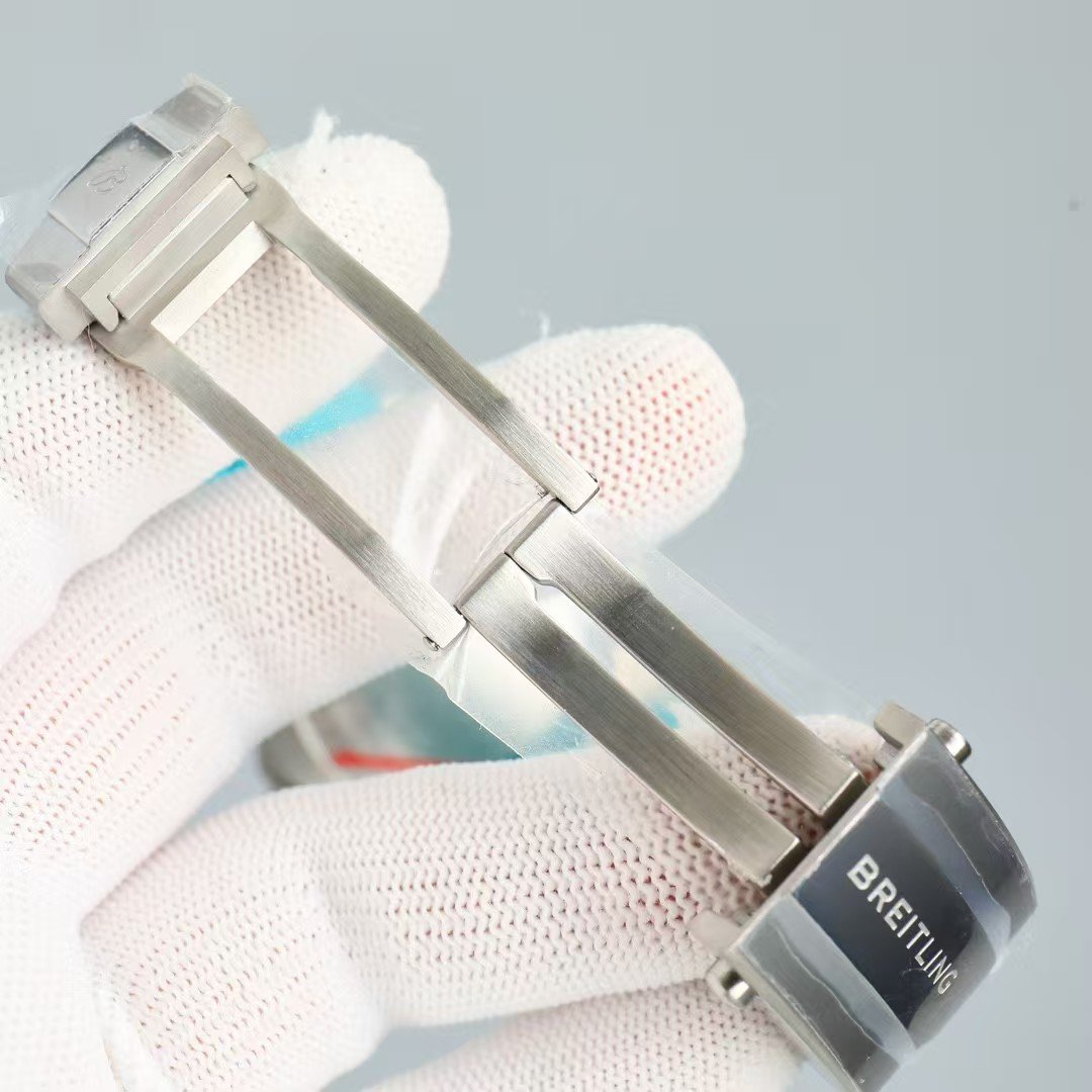
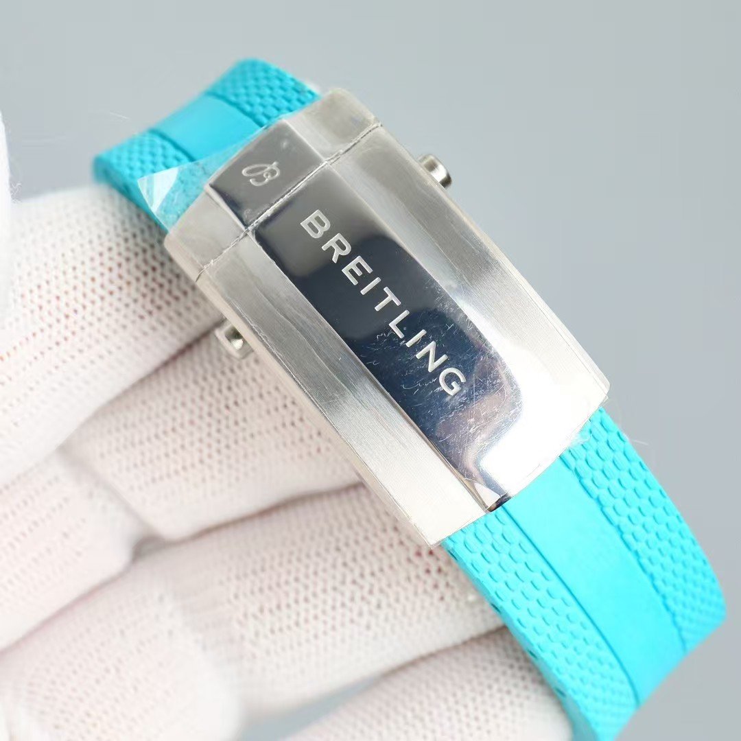
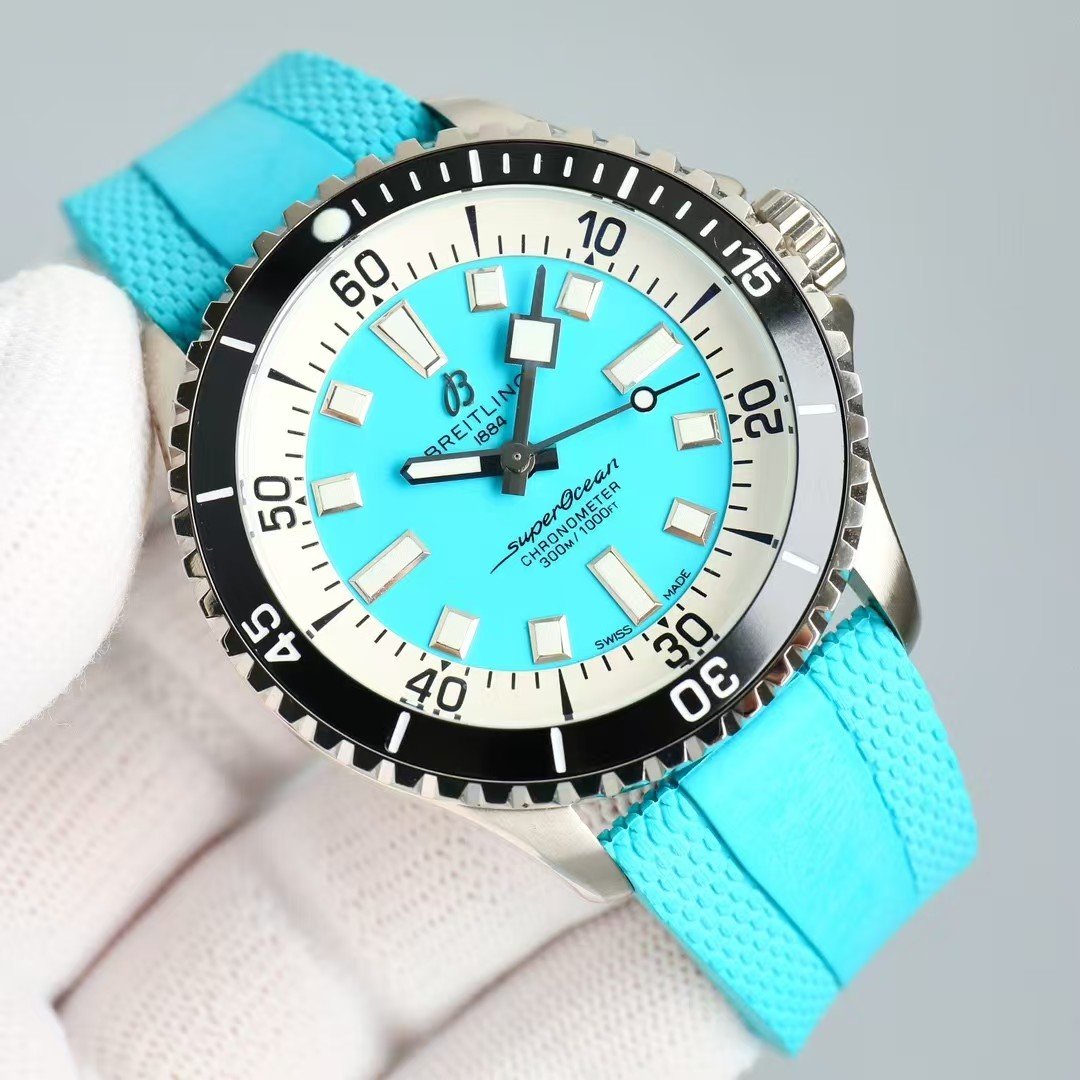
4. Strap Feel — Matched Color, Not Matched Plastic
The turquoise strap is flexible without feeling cheap.
It doesn’t try to match the dial perfectly, which is good—perfect matches look artificial.
Instead, the strap sits one shade softer, so the whole watch doesn’t scream for attention.
When worn tight, it settles comfortably and avoids that sweaty rubber feeling many straps fall into.
5. Daily Use — Where This Color Makes Sense
This isn’t a desk-only color.
It works because it behaves differently depending on where you are.
Morning light:
Soft, pastel, almost creamy.
Outdoor sun:
Sharp edges, high contrast, full of energy.
Night time:
The lume stands out even more against the blue, making it easy to read with a quick glance.
It’s a watch that feels playful without losing purpose.
6. Who This SuperOcean Is For
Someone who doesn’t want a “safe” diver.
Someone who wants color but still wants structure, readability, and a serious diver feel.
Someone who likes the idea of a modern watch that behaves differently throughout the day.
This is not a subtle choice—but it’s a surprisingly wearable one.
7. My Take
Among all the bold SuperOcean colors—yellow, orange, deep blue—this Tiffany tone is the one that stays interesting without feeling tiring. It lifts the mood, keeps the dial readable, and gives you something the darker versions can’t. But like always, the last word is yours: you decide whether this color fits your life or just your eyes.